
Philosophy Beauty
Hand Cream Launch
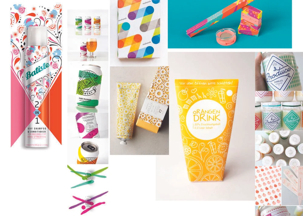
Hands of Hope was one of Philosophy’s popular SKUs, but the brand needed a refreshed approach. While Philosophy maintained strong loyalty among customers 30+, capturing younger demographics remained a challenge. The objective was to create a playful, approachable product—either as an easy cash-wrap add-on or as a new category designed to resonate with younger users. After aligning with the marketing manager on upcoming scents and launch vision, I began concepting how the tubes could be produced to deliver on both brand identity and audience appeal.
1)
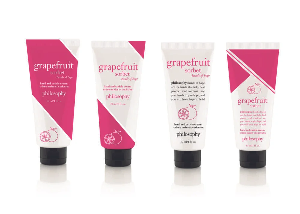
Building on Philosophy’s roots in nostalgic imagery, we explored vintage floral engravings to evoke an old-fashioned yet fresh feel. After market research and inspiration gathering, we developed initial concepts with small illustrations, considering deco vs. wrap printing and how subtle color accents could add a playful, modern touch.


2)
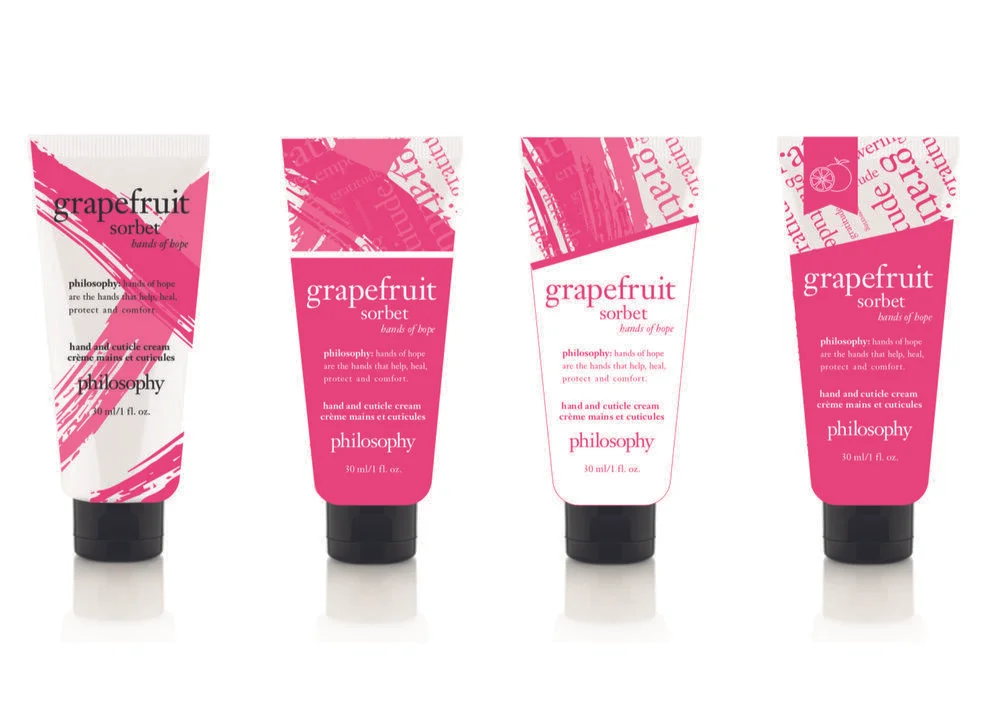
When the initial illustration direction felt flat and misaligned with the target market, I expanded inspiration research to explore playful uses of color. Monoline illustrations and bolder graphic treatments were developed, though ultimately deemed too far from Philosophy’s core brand identity.
3)
To strike a balance between playful icons and Philosophy’s classic aesthetic, I explored different shaped nameplates. Concepts included traditional copy layouts with subtle color accents, as well as photographic icons that complemented the featured scents.


4)
To minimize unique components, a full-color tube was ruled out in favor of a color wrap. Staying true to Philosophy’s iconic use of nameplates, a square header became the focal point. This project allowed me to explore multiple creative directions for a new SKU, while ultimately returning to the brand’s core strength—classic, simple design.
