Philosophy Beauty - Coty
Holiday Program
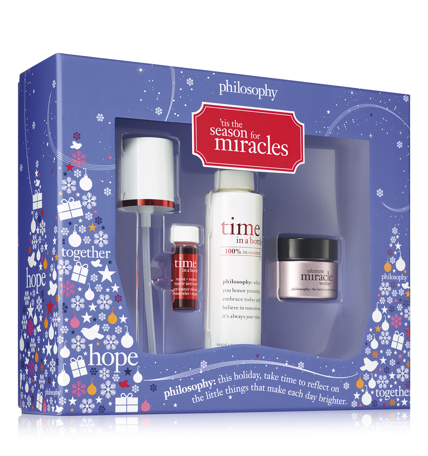
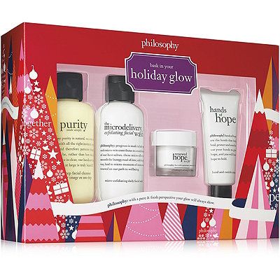
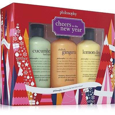
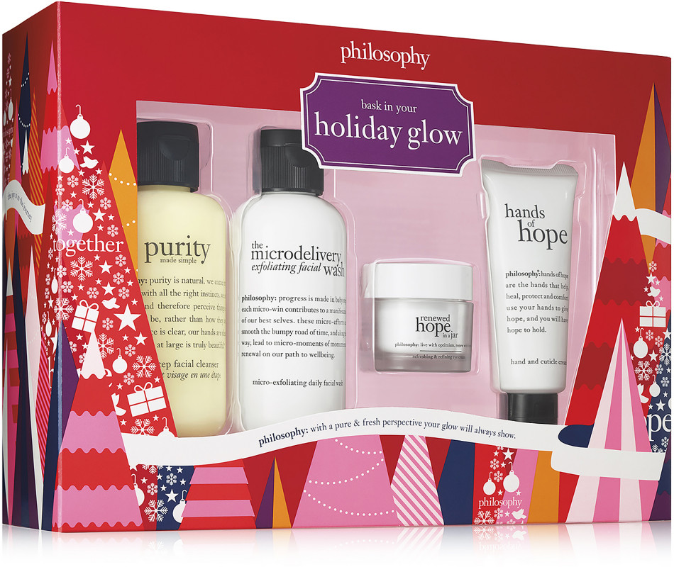
For any major national brand holiday is the number one focus and priority category for sales and Philosophy is no exception. Ensuring proper release of graphics and updating final graphics for various skus including bottle and jar wips, set boxes, and folding cartons was of utmost priority with my time at Philosophy. I was in charge of all packaging graphics headed out the door for the Philosophy holiday as I worked closely with our production and product sourcing teams for optimum results across a breath of retailers.

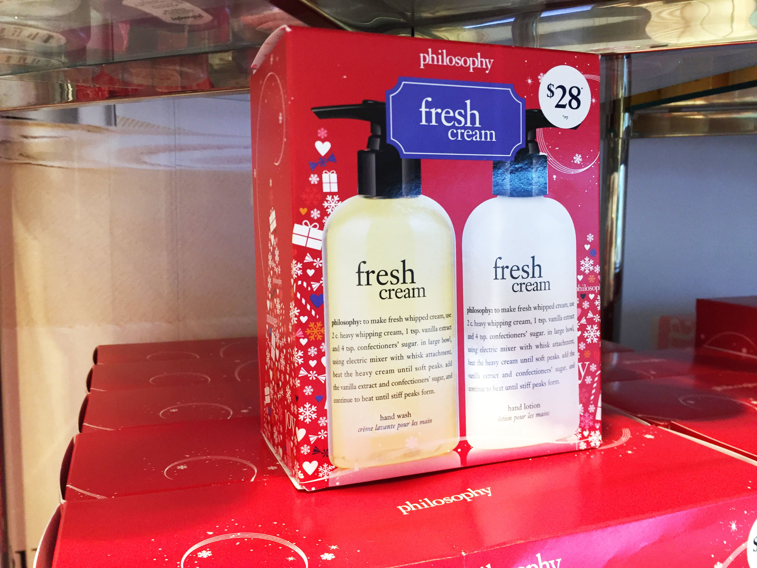
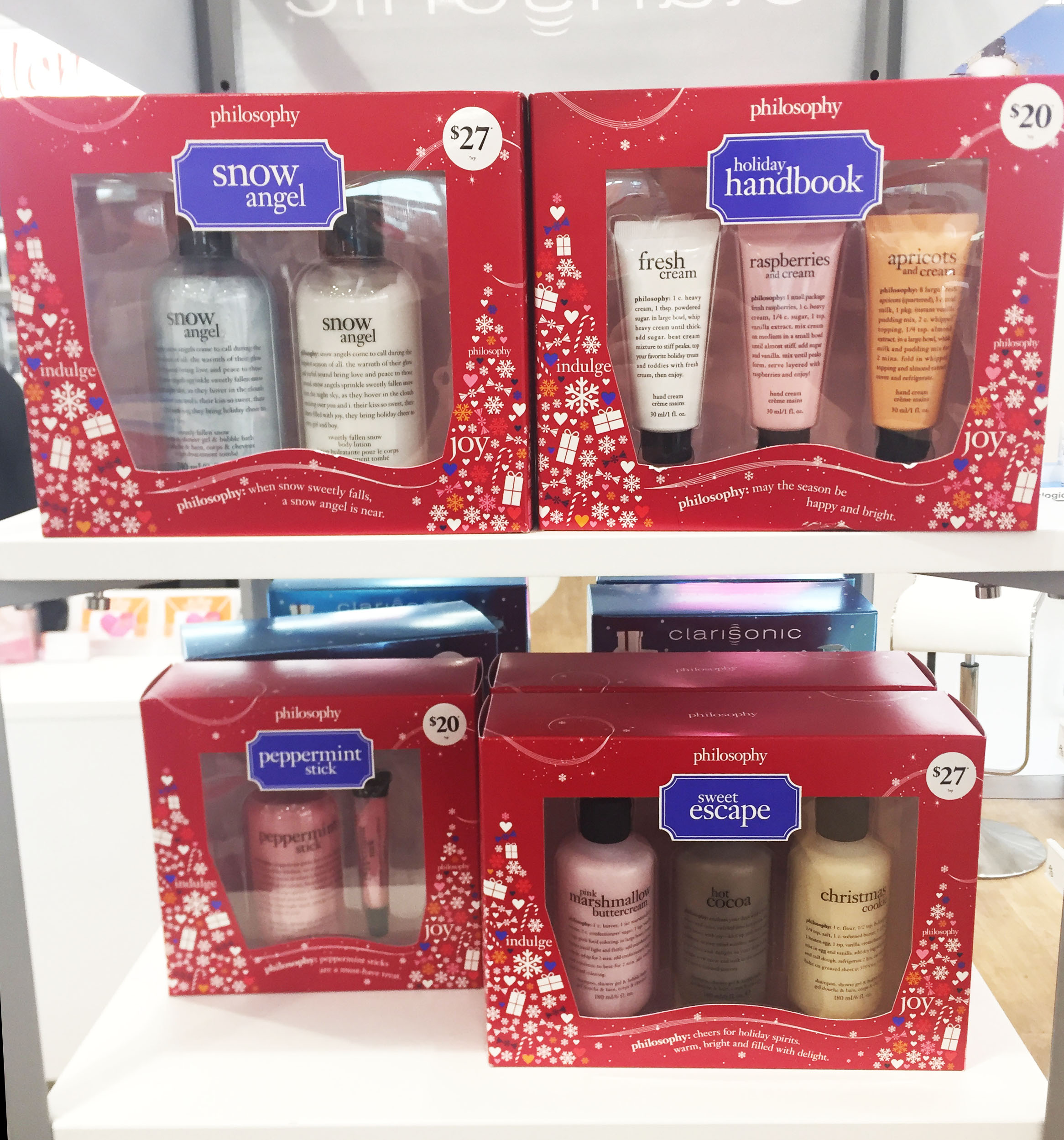
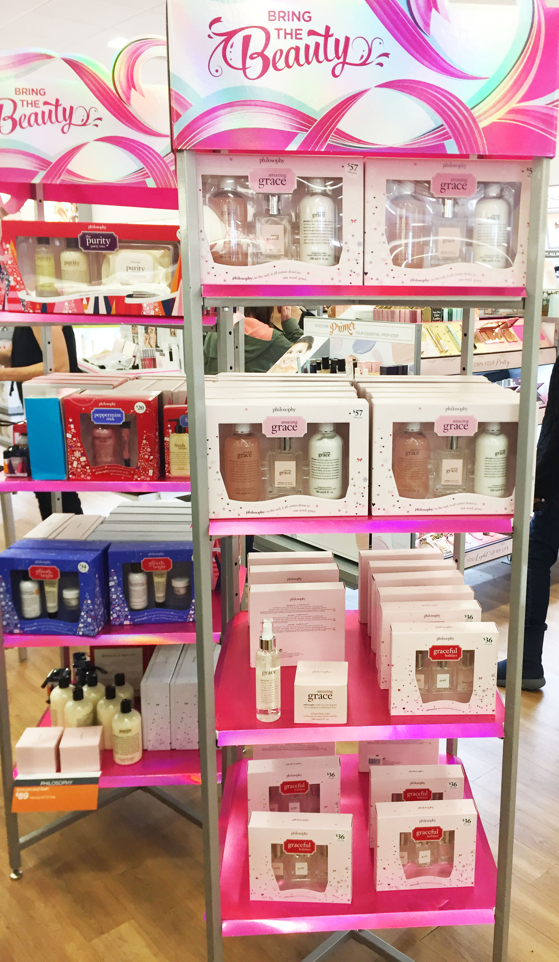
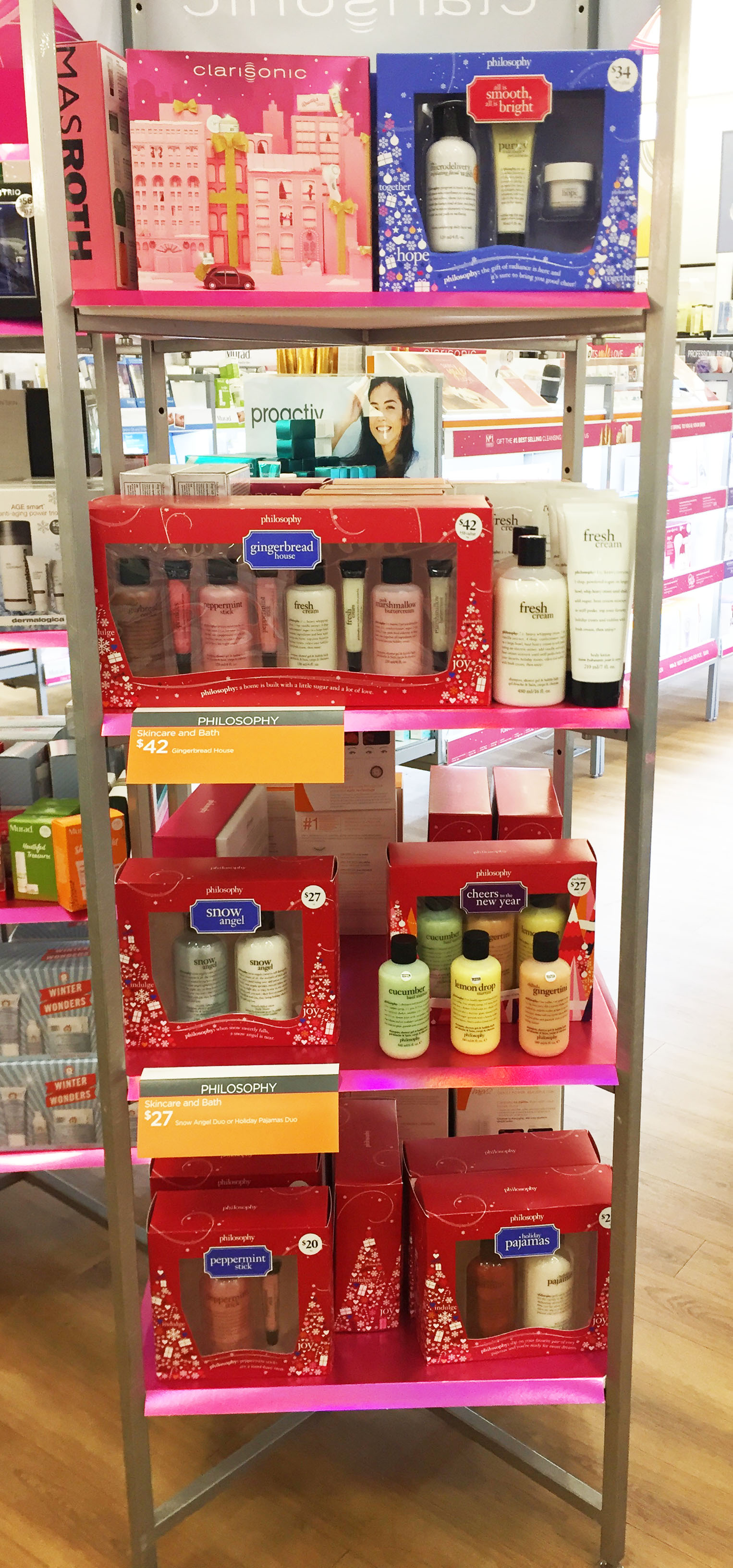
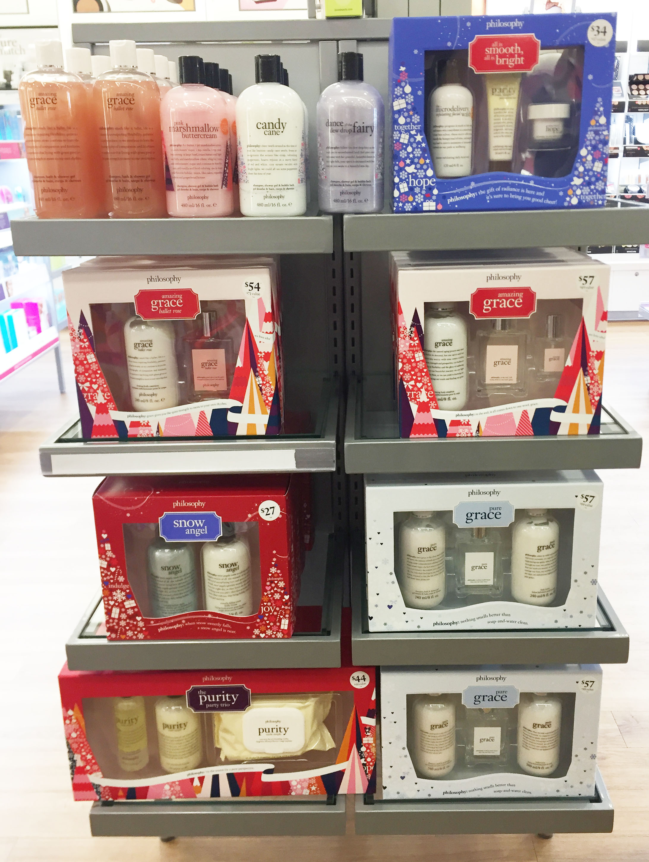
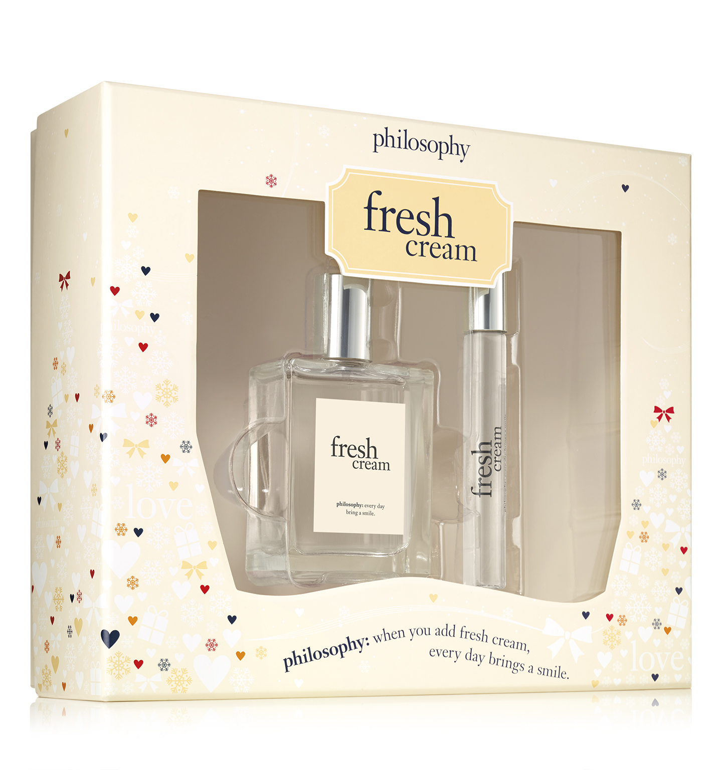
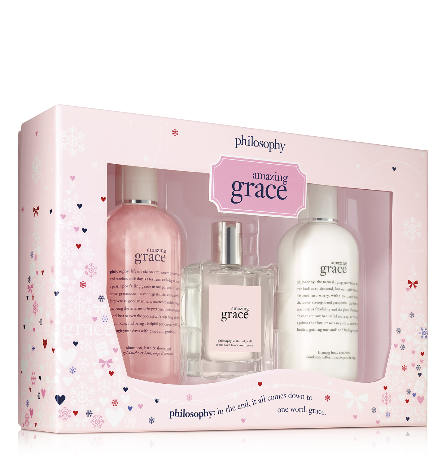
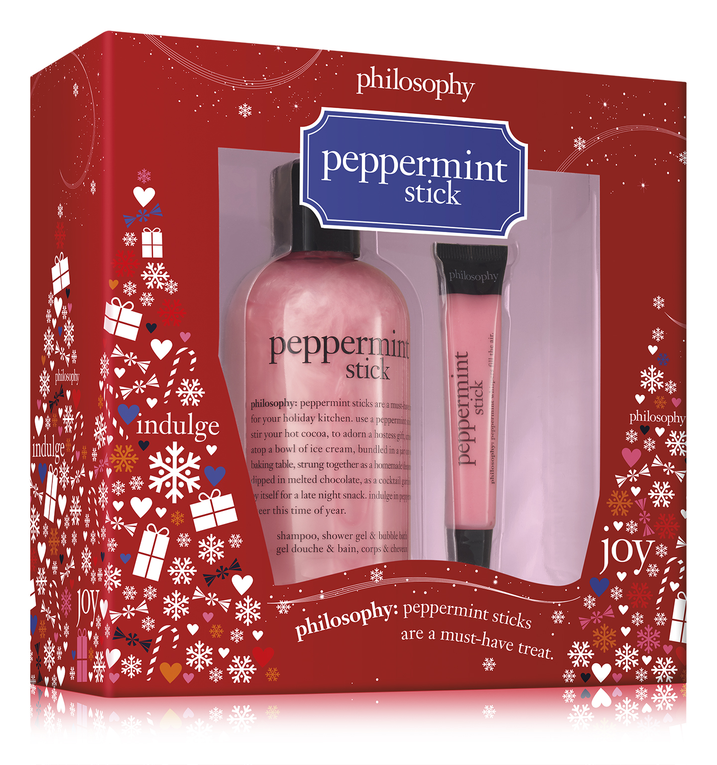
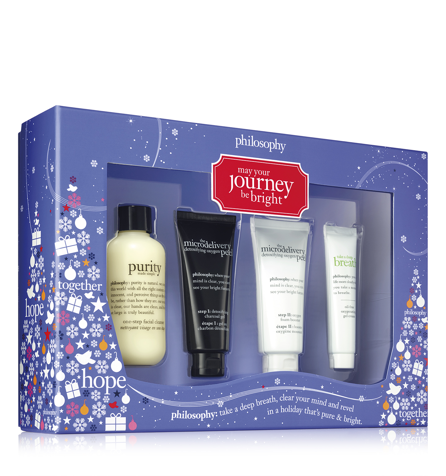
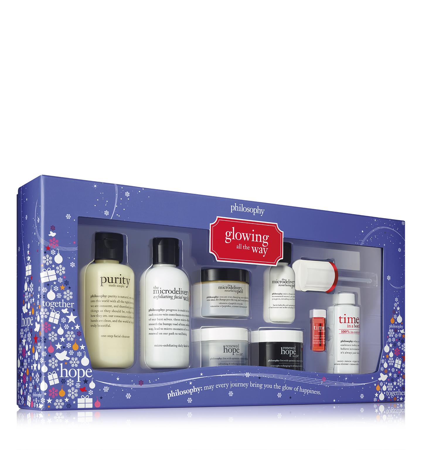

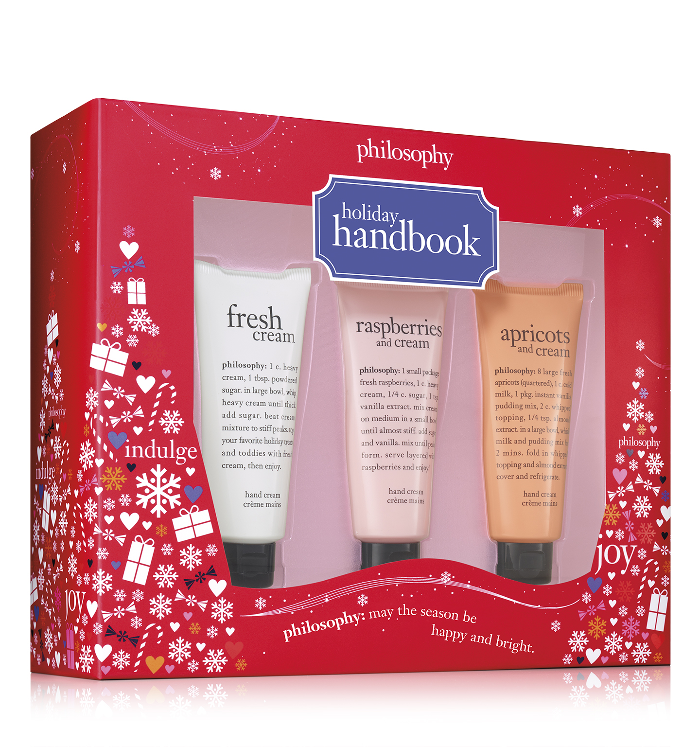
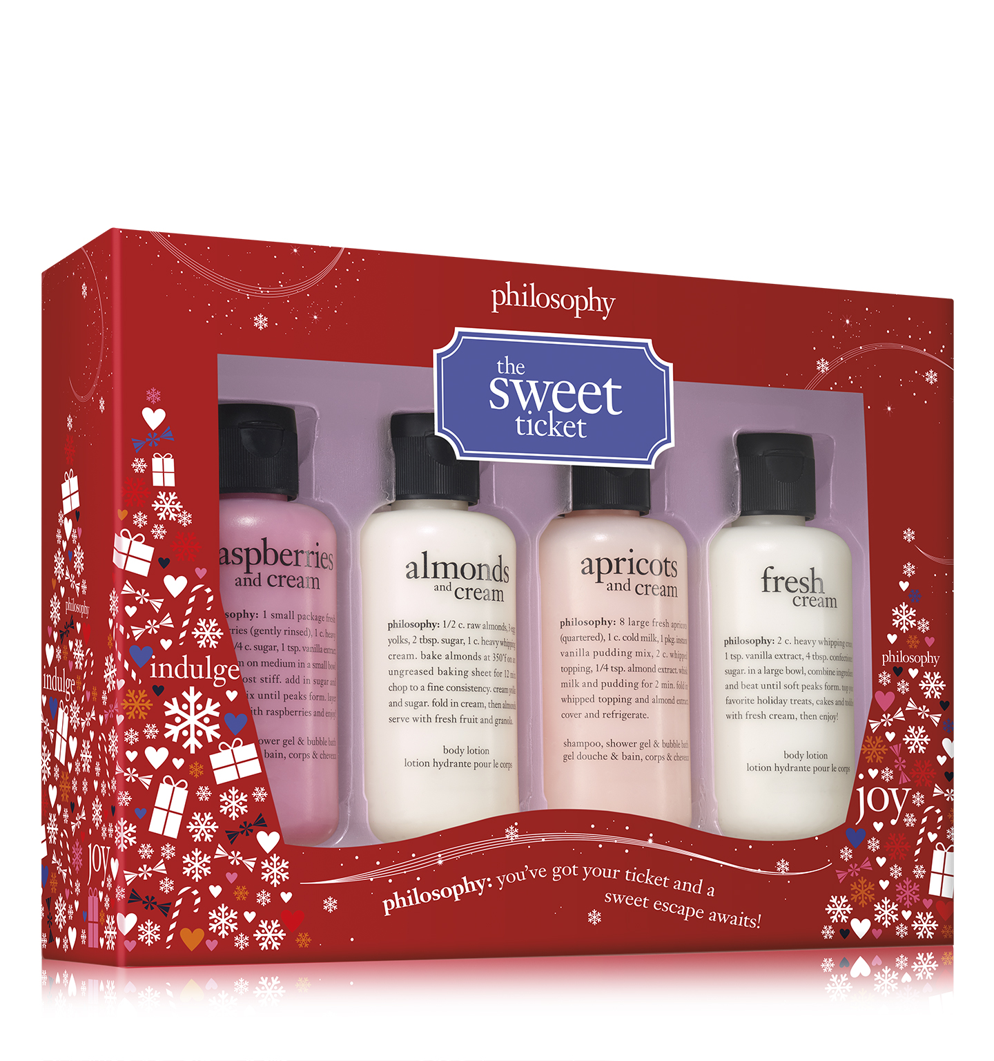
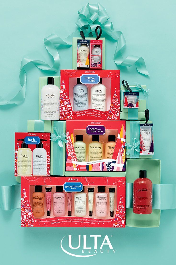
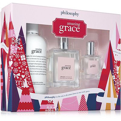
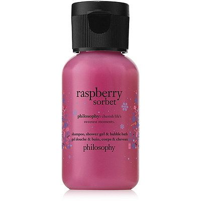
Every distinct franchise received their standard color such as "amazing grace pink". Bath and body kits are categorized by red cartons and set boxes
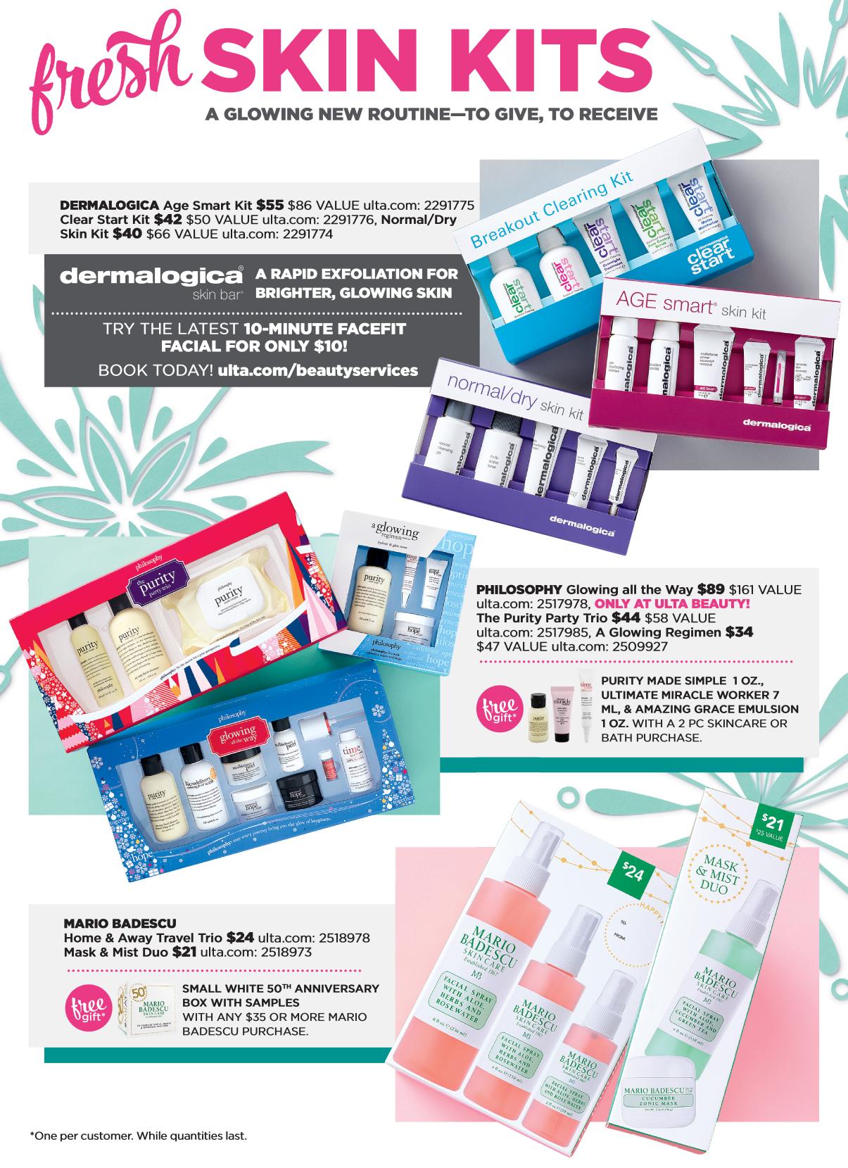
while skincare kits are featured in blue. These were sold nationally at all available retailers. Set boxes for amazing grace and some
distinct bath and body kits featured a repeat pattern throughout the interior and exterior of the bottom box component designed by myself.
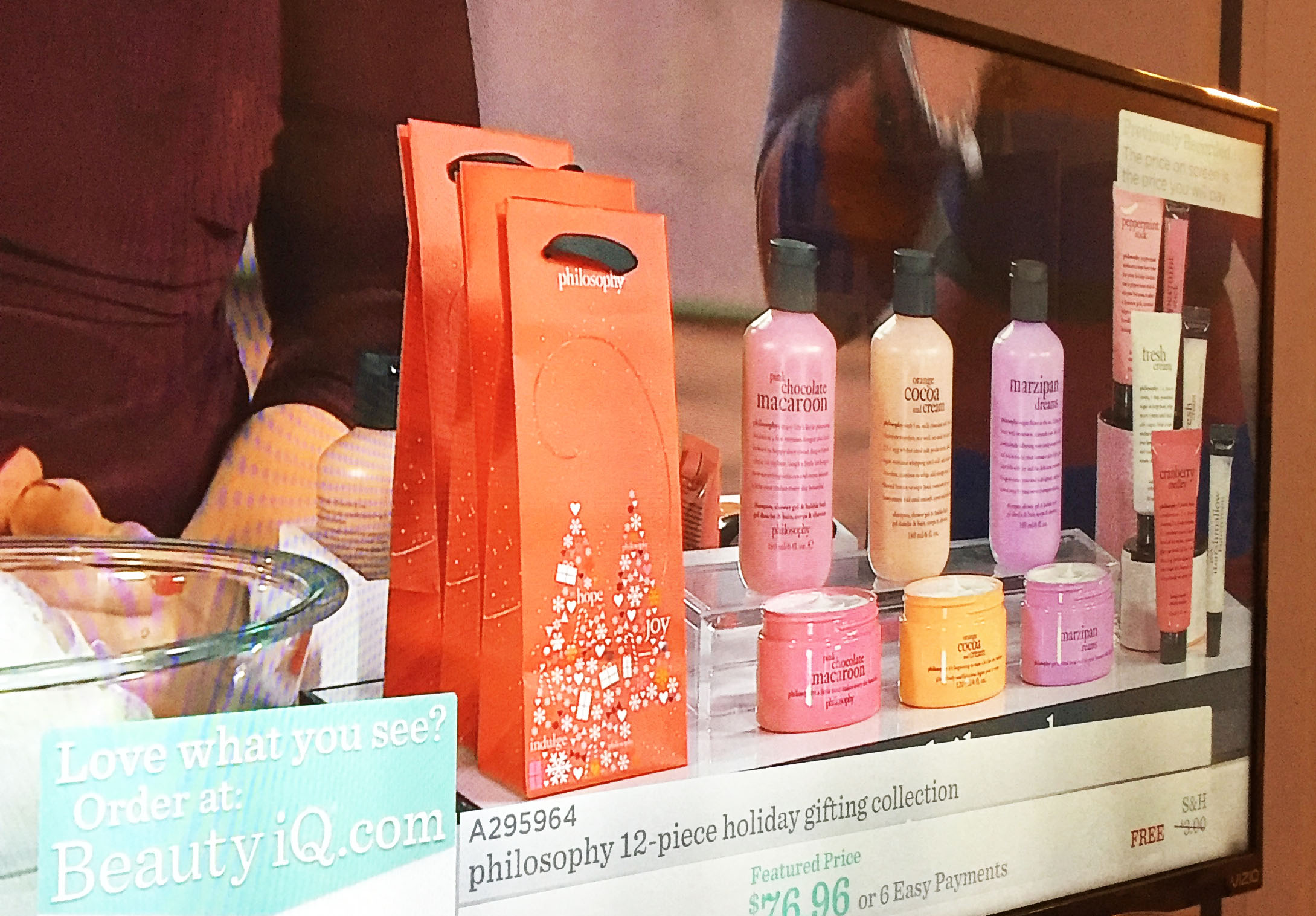
QVC
QVC is a distinct retailer for Philosophy in which they get exclusive offerings in particular sizes and configurations. Developing all gifting items was a
project I tackled that included two sizes of gift bags, gift box, gift tag with the holiday theme carried throughout.
I also worked on a lot of direct-deco label layouts for various new products.
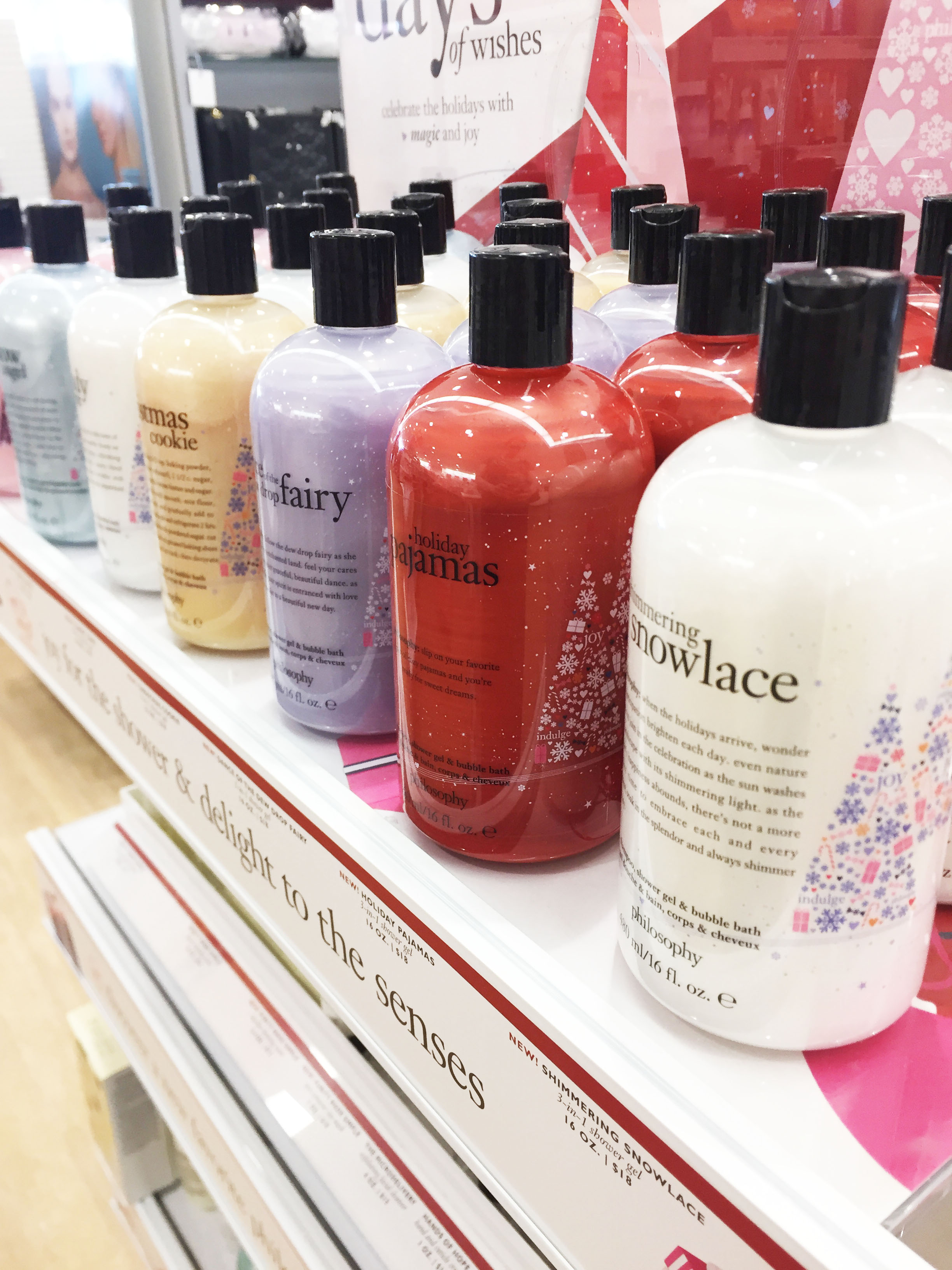
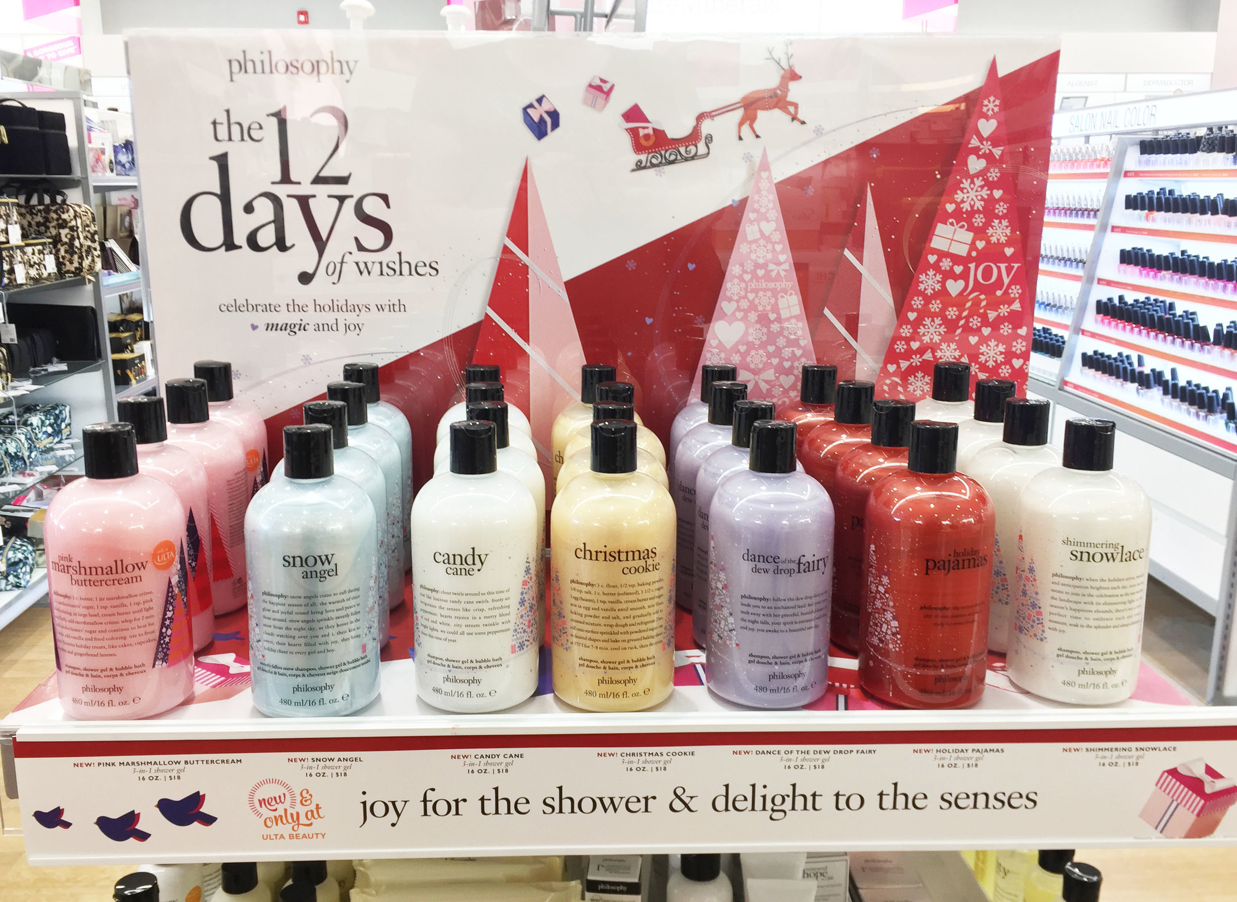
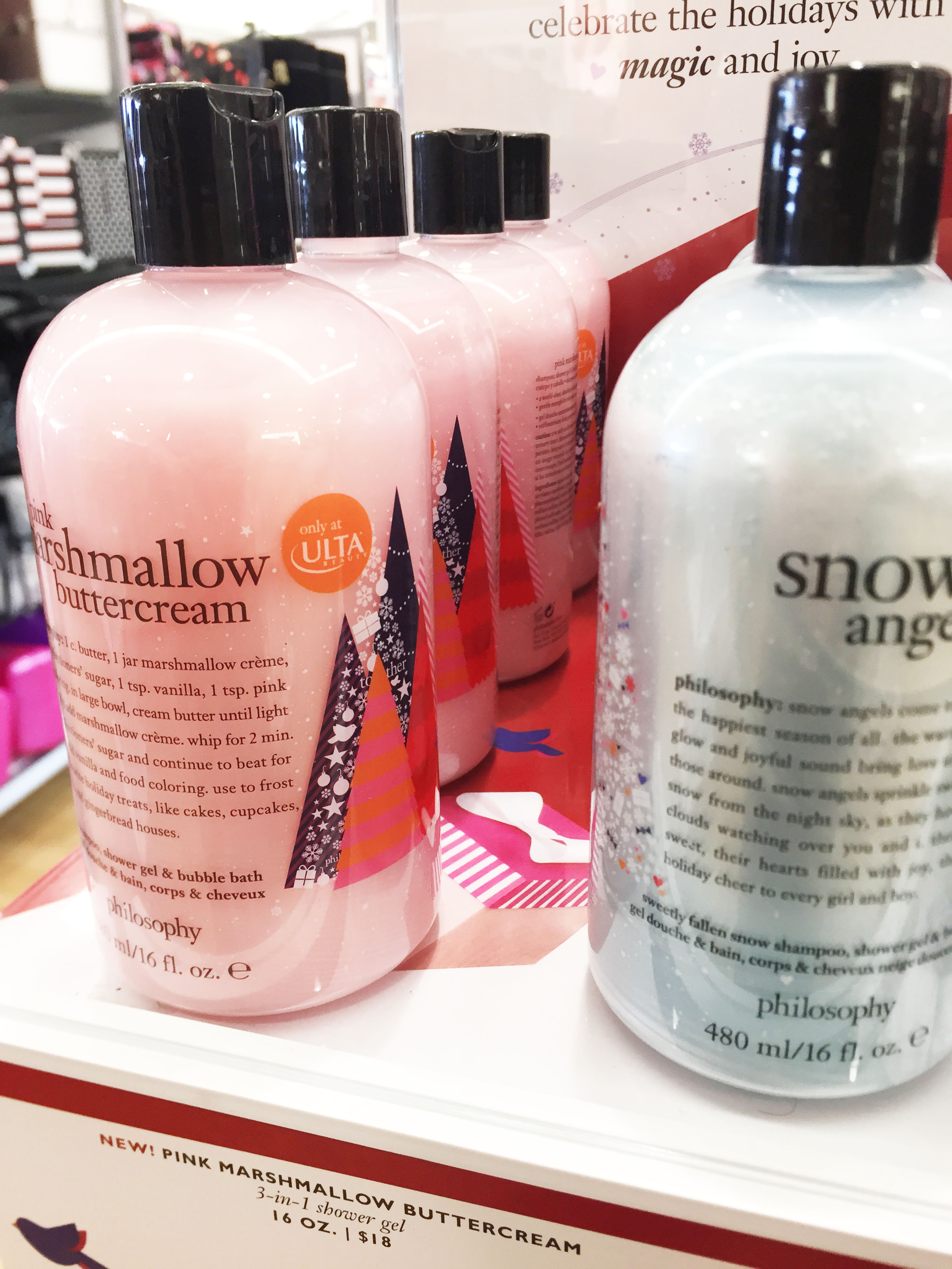
Ulta
Ulta is Philosophy's number 1 retailer. With this distinction they get exclusive sets and particular designs that will only grace Ulta stores and online shop.
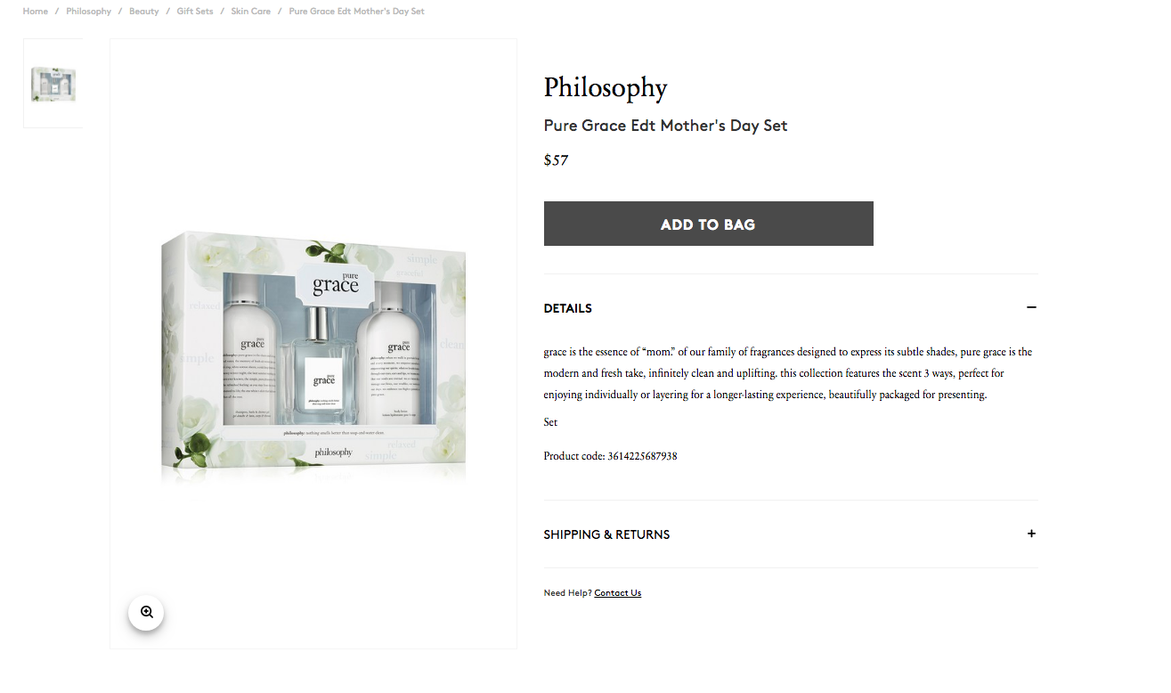
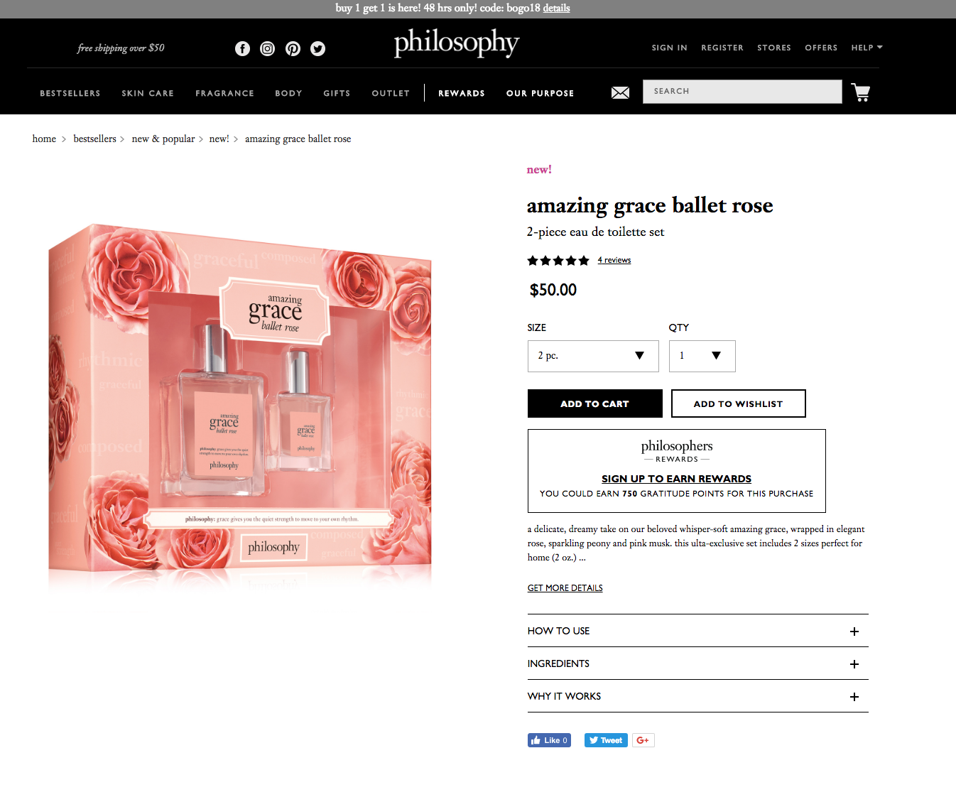
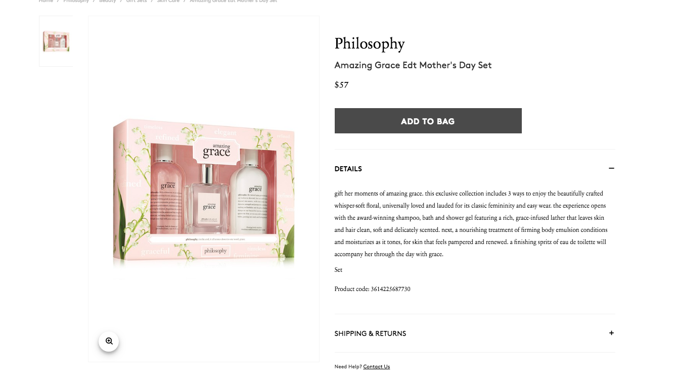
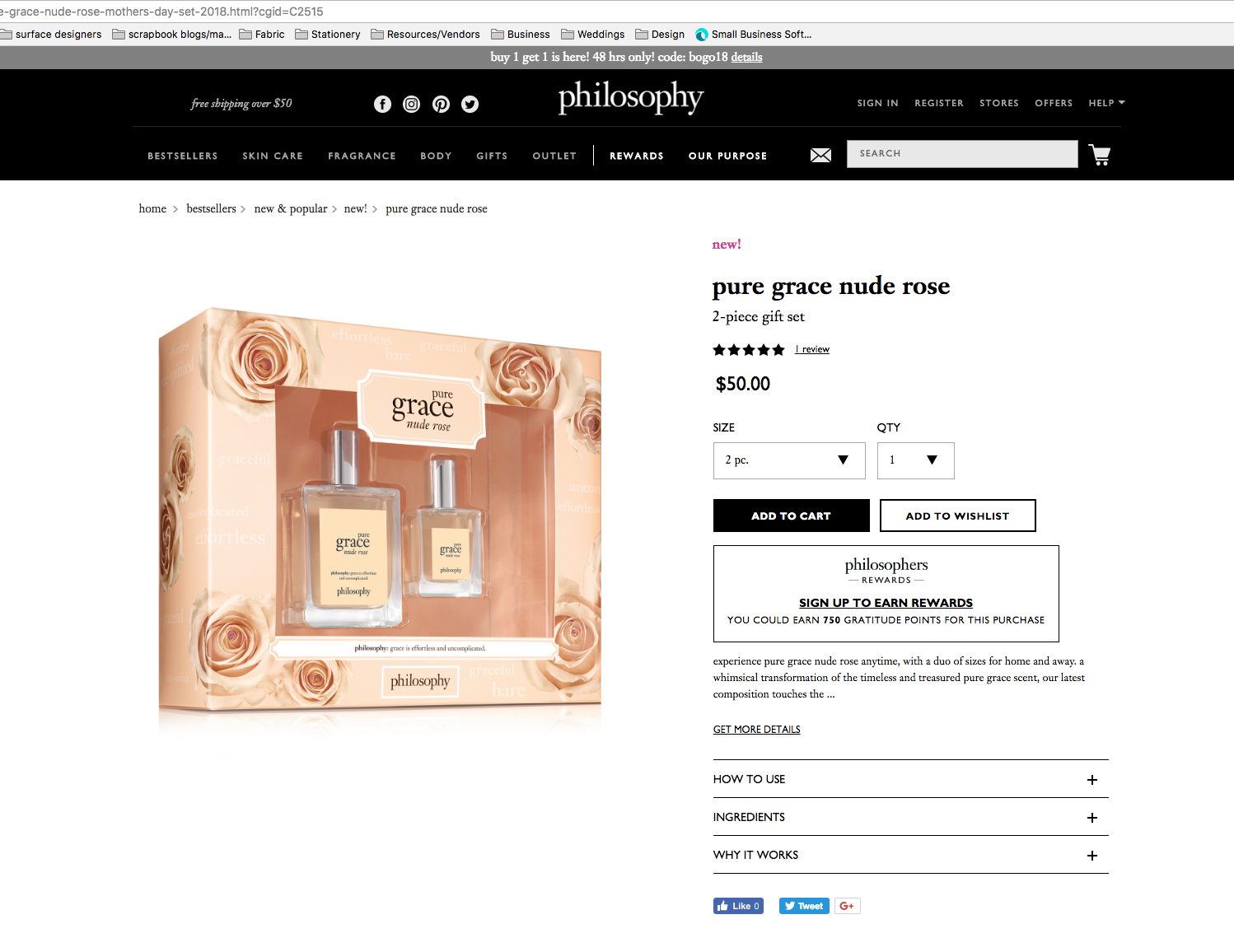
Mothers Day Sets
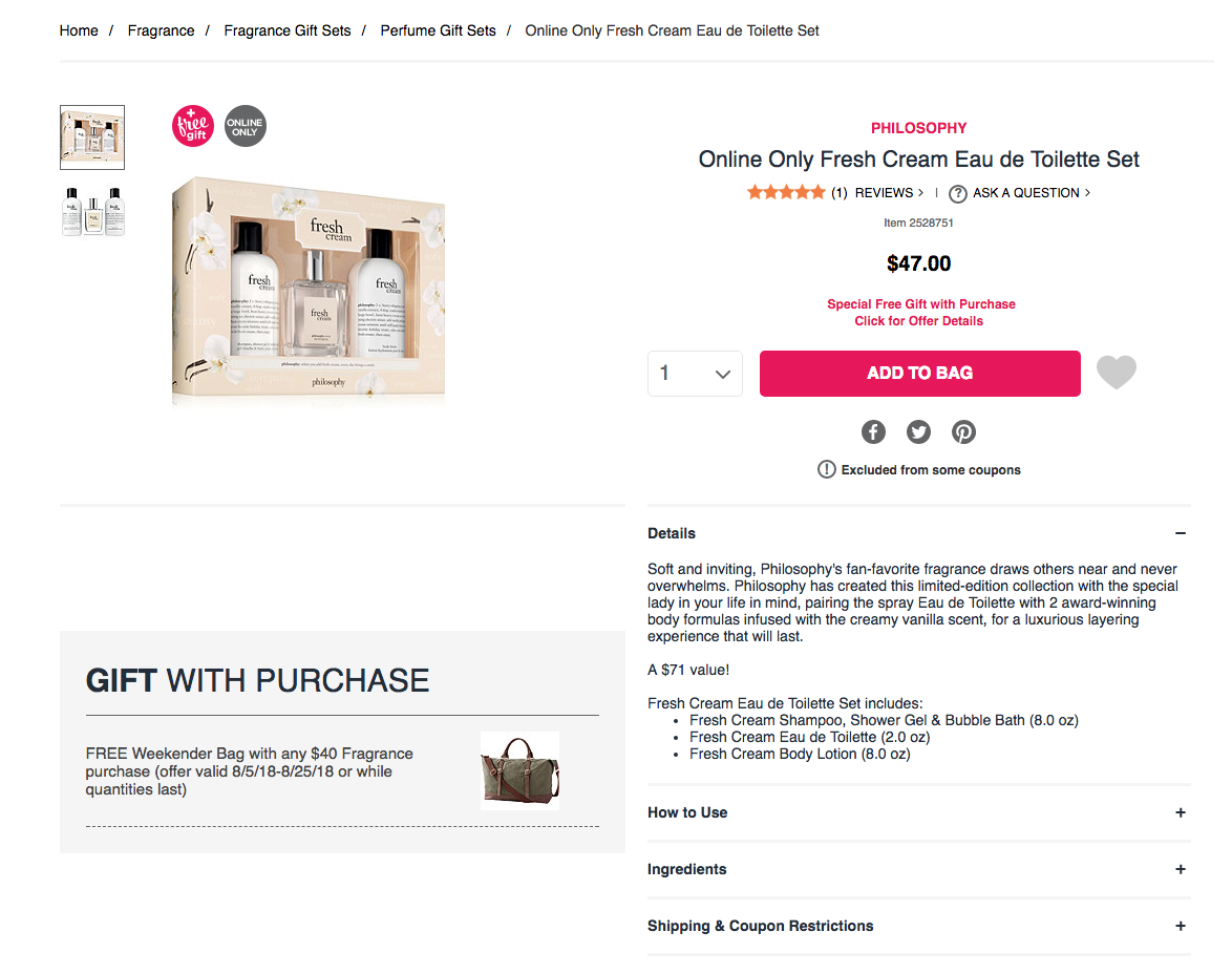
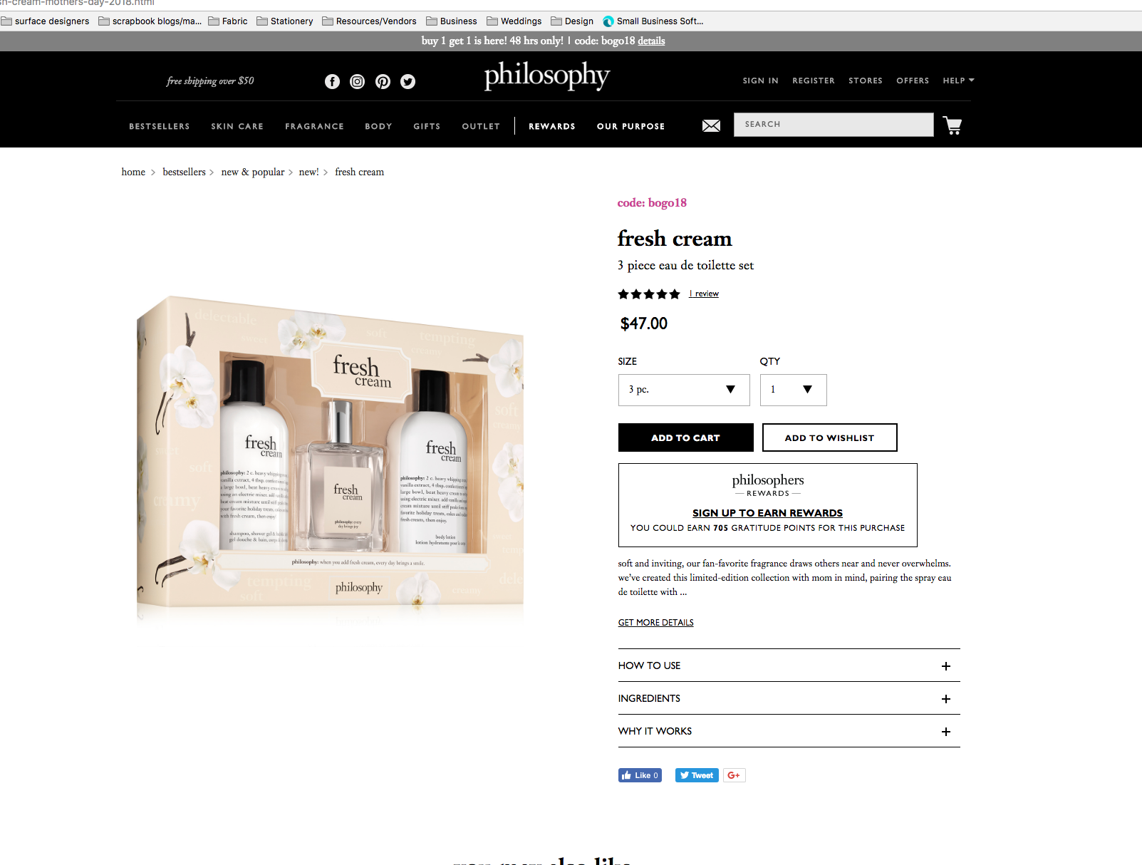
A peak part of the season is mothers day fragrance sets. I developed 4 unique scent specific boxes for various retailers to highlight during the spring season. New photography was requested from the campaign team to be able to have a better selection of images that represented the brand better, each was edited and modified for our need. In the open spaces between all the florals is various key words that are true to the Philosophy brand such as “beauty, relaxed, smile.” The words got a spot gloss treatment to give them a subtle but more unique spin on their existence on the sets. Each box was fairly time consuming due to the updating of photography constantly and the re-organization of the words around the images. The goal was to keep them organic while having the structure of the copy in the background.